Clock icon by Icons8
[*i.e. non-SVG-based rendering].
Requirements (a sw-component):
- for the purpose of compiling your styles [on-the-go] and
- to launch 'live-server'.
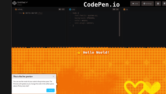
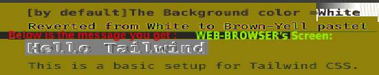
Pre-requisites ( npm commands: npm install & npm run dev ): install and run TailwindCSS
Tailwind (OpenSource-sw as is) has a shortcoming: it doesn't come w/ pre-designed UI components eg. Cards / Buttons. Instead, it's a low-level class, that lets You build custom designs. However, this means that for instance Cards and Buttons, for that matter, are some of the many possible to implement. So define Tailwind components as follows:
its @layer components {
(for a) .card (And,) @apply "a FlexBox", justified & centered (or so).
In this project, I jumped into ready-made Logos [downloadable in two file-formats, SVG is recommended]. My Discovery: Logos can be placed on web-pages [pasting its tag 'inline' or as SVG-file].
By default [inline-tagged] Logo's size-values are not big enough to notice it. Making an adjustment to size better ables to produce the Logo to look more like a bigger and even colored Logo (that looks more like an 'ICON').
Through a Trial & 'No-Error'-msg, the Lesson Learnt: style.css in this project needed adding a style-class-tag-definition. So [**tag: svg xmlns=... class=ˇw-[value] h-[value]ˇ] placing these values in index.html adjusts SVG even up to be looking-like-an-'ICON'
[**in my experience, this was the case: custom.css has 'GlobalStyles' that apply to other projects' web-page content as well. So in some page-design scenarios, the size-adjustments to Tailwind's class-coded values often in design, is to resize inline placed Logo. Well it was tricky! And, inline-Logo might not show on browsers like Safari* [*Stackoverflow.com has comments on Safari related render issue]
For instance [Get Stated using]: section className="m-12 flex h-screen items-center justify-centre bg-green-400 text-center text-3xl¨